
Why Variable Fonts are the Future of Web Performance

In the early days of web design, typography was a heavy burden on performance. If a designer wanted to use a bold, an italic, and a light version of a single typeface, the browser had to download three separate files. This increased HTTP requests and slowed down page load times significantly. However, the emergence of Variable Fonts has completely shifted this paradigm. By allowing a single font aesthetic file to behave like an entire family of styles, they offer a streamlined solution that balances rich typography with lightning-fast load speeds.
The Evolution of Typography on the Web
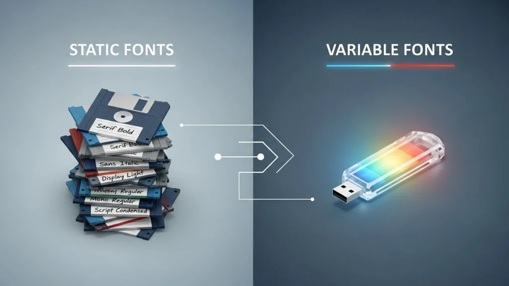
For decades, web developers have been caught in a tug-of-war between aesthetics and optimization. Static fonts (TTF, OTF, or WOFF2) are rigid. Each weight (thin, medium, bold) and each style (italic, condensed) requires its own individual file. On a modern, typography-heavy website, it isn’t uncommon to see 500KB or more dedicated just to font files.
Variable fonts, based on the Open Type font variations specification, change this by using “axes” of design. Instead of multiple files, you have one file containing the data for every possible variation. This evolution isn’t just a convenience for designers; it is a fundamental shift in how we approach the “performance budget” of a modern website.
How Variable Fonts Boost Web Performance
The primary reason these fonts are considered the future of web performance is their efficiency. Here is how they optimize the user experience:
Reduced File Size and HTTP Requests
The most immediate benefit is the reduction in payload. While a single variable font file might be slightly larger than one static file, it is significantly smaller than a collection of four or five static weights. By consolidating these into one request, you reduce the overhead of multiple server connections.
Improved Core Web Vitals
Google’s Core Web Vitals, specifically Largest Contentful Paint (LCP) and Cumulative Layout Shift (CLS), are heavily influenced by how fonts load. Because variable fonts deliver all weights in one package, the browser can render the correct styles much faster, leading to a more stable loading sequence.
Granular Design Control via CSS
With static fonts, you are limited to the weights provided. Variable fonts allow for infinite variations along an axis. This level of precision allows for “fluid typography” that adjusts dynamically based on the user’s screen size or even their ambient light settings.
Implementation: The Technical Edge
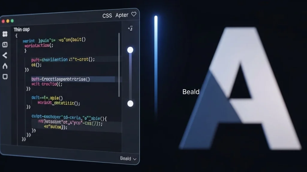
Integrating these fonts into a workflow is straightforward. Instead of a standard @font-face declaration for every weight, you use a single declaration and define the ranges for the axes. This means a developer can programmatically “tweak” the typography to fit the layout perfectly, ensuring that the text remains legible and beautiful on everything from a smart-watch to a 32-inch 4K monitor.
Future-Proofing Your Website
As we move toward a web that demands high-speed interactions and accessibility, the old way of handling typography is becoming obsolete. Browsers have broad support for variable technology, and most premium foundries and Google Fonts now prioritize variable formats.
By adopting this technology, you aren’t just making your site look better; you are stripping away the technical debt that slows down your users. You are providing a faster, more accessible, and more responsive experience that aligns with Google’s modern ranking signals.
Conclusion
The shift toward Variable Fonts is a rare “win-win” in the world of web development. Designers get total creative freedom without the guilt of bloating the page, and developers get a cleaner, more efficient codebase. As performance becomes an even larger factor in SEO and user retention, consolidating your typography into a single, flexible asset is no longer just an option—it is a necessity for the modern web.