Top 12 Retro Aesthetic Fonts for a 90s Throwback
Today, designers are looking back to this “golden age” to capture a sense of nostalgia that feels both familiar and exciting. To achieve that authentic look, choosing the right retro aesthetic fonts is the most critical step in your creative process. Whether you are designing a streetwear brand, a nostalgic social media campaign, or a website with a Y2K edge, the typography you choose sets the tone. In this guide, we’ve curated the top 12 fonts that embody the spirit of the 90s.
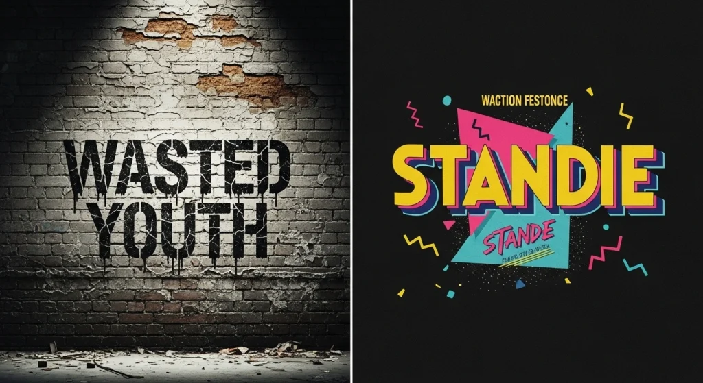
1Wasted Youth (The Grunge Essential)
Nothing says “90s” like the raw, unpolished energy of the grunge movement. Wasted Youth is a quintessential choice for designers aiming for a rebellious, hand-drawn look. Inspired by skater culture and punk rock flyers, its jagged edges and uneven strokes make it perfect for high-impact headlines that refuse to follow the rules.
2Standie (Bold & Blocky)
If you are looking for retro aesthetic fonts that demand attention, Standie is your go-to. This font aesthetic features thick, solid letterforms reminiscent of the big-budget movie posters and VHS covers of the mid-90s. It’s confident, readable, and brings an immediate sense of weight to any layout.
3Thunderstorm (The Pop Culture Icon)
Thunderstorm takes inspiration from the vibrant “saved by the bell” aesthetic. It’s a brush-style font that feels kinetic and fun. With its exaggerated swashes and hand-painted texture, it’s ideal for projects that need to channel the upbeat, neon-soaked side of the decade.
4Blobie (Rounded & Swirly)
The 90s also had a softer, more playful side, often seen in Nickelodeon-style branding. Blobie is a rounded typeface that feels “liquified.” Its bubbly nature makes it a favorite for Gen Z-focused designs that want to tap into the “kidcore” aesthetic.
5East Garage (The Alt-Rock Choice)
East Garage is a gritty, slanted font that looks like it belongs on a garage band’s demo tape. It leans into the “Anti-Design” trend of the 90s, where perfection was traded for personality. It works exceptionally well when paired with grain textures and distorted imagery.
6Milenia (Cursive Elegance)
Not all 90s fonts were loud; some were surprisingly elegant. Milenia is a bold script font that captures the “high-end” commercial look of the late 90s. Think of luxury magazine ads or iconic sitcom title cards. It’s sophisticated but still maintains that chunky, retro thickness.
7Arcade Classic (The Digital Frontier)
The 90s were defined by the rise of home gaming. Arcade Classic brings the pixelated, 8-bit aesthetic into a modern format. It’s the perfect choice for tech-themed projects or any design that wants to reference the early internet and gaming revolution.
8Funk Gibson (Groovy & Curvy)
This font is a beautiful hybrid of 70s curves and 90s boldness. It represents the “re-retro” phase of the 1990s when designers were reinterpreting disco-era shapes with a modern, digital twist. It’s energetic, swirly, and incredibly stylish.
9Tumb Ink Trap (The Underground Vibe)
Ink traps were originally a technical necessity in printing, but in the 90s, they became a stylistic choice. Tumb is a blocky font with aggressive cuts that feel industrial and underground. It’s a staple for streetwear branding and edgy editorial layouts.
10Balgin (The Versatile Sans)
Balgin is a comprehensive font family that ranges from condensed to wide. It captures the “corporate yet cool” look of early 90s tech companies. It’s clean enough for body text but has enough character in its heavier weights to serve as a powerful display font.
11Retro Boldy (Modern Meets Nostalgia)
As the name suggests, Retro Boldy is all about maximum impact. It features high-contrast strokes and a “puffy” appearance that was everywhere on snack packaging and toy boxes. It’s a nostalgic powerhouse that feels warm and approachable.
12Lico (The Futuristic Vision)
In the late 90s, the “Y2K” aesthetic began to take over, focusing on chrome, transparency, and the future. Lico is a sleek, wide font that feels like it belongs in a sci-fi movie or a 1999 tech catalog. It’s the perfect bridge between retro and futuristic.
How to Use Retro Aesthetic Fonts in 2026
- ✦Contrast is Key: Pair a loud 90s display font like Wasted Youth with a clean, minimalist sans-serif.
- ✦Color Palettes: Stick to iconic 90s colors—think teal, magenta, and bright yellow.
- ✦Texture Matters: Adding a slight “noise” filter helps fonts feel pulled from vintage magazines.