
Aesthetic Handwriting Fonts for Digital Note-Taking
Transform your digital workspace into a visually calming masterpiece with the perfect blend of legibility and style.
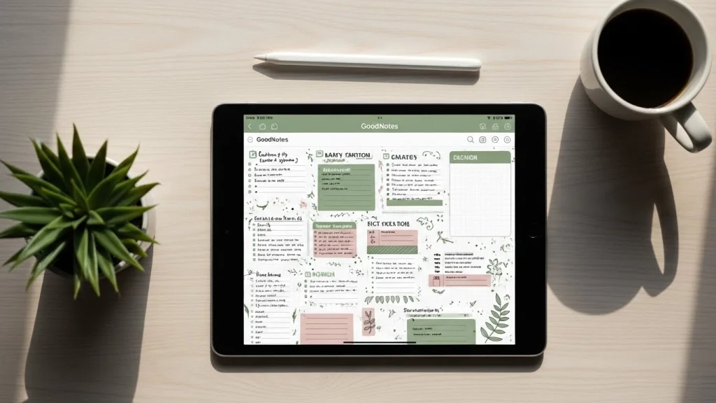
The transition from paper to pixels doesn’t mean you have to sacrifice the personal touch of a handwritten journal. Whether you are a student perfecting your study guides or a professional organizing your daily planner, using aesthetic handwriting fonts can transform a cluttered digital page into a visually calming masterpiece.
Digital note-taking has evolved beyond standard system fonts. Today, creators are looking for that perfect balance between legibility and “Pinterest-worthy” style. In this guide, we will explore the top font choices that mimic real penmanship while keeping your digital notebooks organized and beautiful.
Why Use Aesthetic Handwriting Fonts?
Choosing the right typeface is about more than just looks; it’s about the “vibe” of your digital workspace. Standard sans-serif fonts like Arial or Helvetica can feel cold and clinical. In contrast, a carefully selected script or print font can make your digital planner feel like a premium physical notebook.
When you use an aesthetic font, you are engaging in a form of “digital scrapbooking.” It makes the process of reviewing your notes more enjoyable, which can indirectly improve your retention and focus. If your notes look good, you are more likely to revisit them.
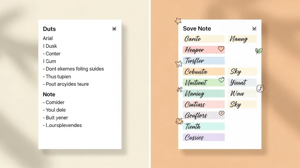
Top 7 Aesthetic Handwriting Fonts for Digital Note-Taking
01The Minimalist Architect
Inspired by the neat, all-caps lettering used by architects. Characterized by straight lines and consistent heights. Perfect for dense study notes.
02The “Sunday Morning” Script
A “bouncy” cursive font that looks like someone wrote it quickly with a fine-liner pen. It adds a decorative touch to headers without being as difficult to read as traditional calligraphy.
03The Fine-Liner Monoline
Mimics the look of a 0.3mm gel pen. It is excellent for “dark mode” note-taking on apps like Notability. Modern, clean, and very popular with Gen Z creators.
Font Style
Best Use Case
Legibility
Vibe
Architect Print
Study Summaries
10/10
Professional
Bouncy Script
Title & Headers
7/10
Playful
Thin Monoline
Journaling
9/10
Modern
How to Install and Use Fonts
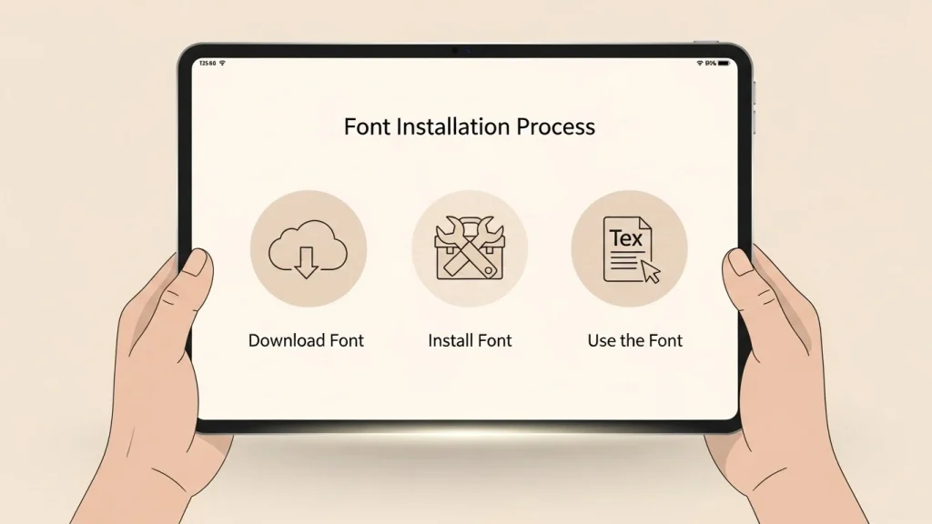
Once you have found your favorite aesthetic handwriting fonts, getting them onto your device is straightforward. Most users prefer using an iPad, but the process works for Android as well.
iPad Installation (Quick Steps):
- Download a font installer like iFont.
- Import your
.otfor.ttffile into the app. - Install the Configuration Profile in iOS Settings.
- Restart your note-taking app (GoodNotes/Notability).
Design Tips for “Pinterest-Worthy” Notes
- Consistent Color Palette: Avoid pure black. Use muted tones like charcoal, sage, or dusty navy for a premium feel.
- Master Layering: Combine a bold serif title with a small handwriting subheader for professional depth.
Elevate Your Notes Today
Ready to transform your digital journal? Start experimenting with these fonts and find your unique style.Explore Font Library